You know the old saying, if it ain't broke don't fix it.
Does the Statue of Liberty need to be jazzed up in designer clothes? How about the Empire State Building? Should it be clad in glass?
These are the things I was thinking about when I saw the new NYC Taxi logos.
At first I thought it was a test to see how well it would do with the public but this is the offical redesign of the logo which will slowly make its way onto the sides of all 13,000 cabs within 6 months.
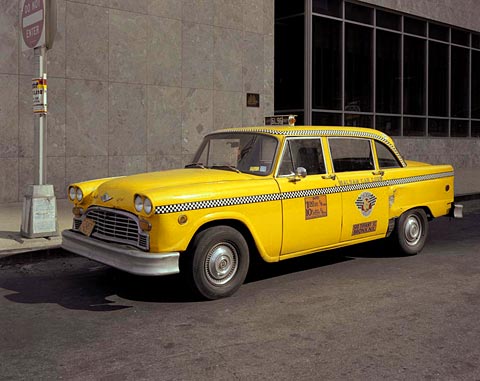
Ugoff and his team are at it again- and they refuse to leave the iconic taxis alone. The old New York Taxi decals were fine as they were, why mess around with them? Didn't the fare box decal just change a couple years ago anyway?
The design committee seems bent on bringing their version of Johnny Cab to the streets of New York.
The new fare box is much smaller than the old fare box and require glasses to read. The encircled "T" on is extremely similar to the route on the subway cars (and is also reminiscent of the Boston T logo).
The font used for NYC Taxi is tacky, loud and too cartoonish. It almost screams "Taxi!" As if we couldn't tell the vehicle is a taxi by the unmistakable yellow paint, the medallion and the roof sign. Yes it is a taxi
What's with the checker pattern on the rear? Designers may be trying to hearken back to the days of the old Checker Marathon cabs but it looks more like it belongs on a race car at the Indy 500. The new logo creates an imbalance that make up the unique characteristics of New York.
Was the public involved with the creation of this new logo? They are the ones who use the taxis after all. How about the cab drivers? Maybe this was the underlying reason of the taxi strike.
If I sound like a grumpy old man, I'm not alone on this issue.
The reviews are in and their not too good either and most New Yorker's aren't that happy with the new look. (Take a look at some of those comments).
Let's hope the old logo makes a return. After all they were fine as they were.
Subscribe to:
Posts (Atom)